For this year’s book list, I wanted to kick it up a notch and add some data visualization. If you don’t feel like reading the details below, here is the pretty visualization of this year’s reading. (If you’d rather just read the details, feel free to skip to the Technical aspects section.)
I really enjoy publishing a year-end reading summary. This inspiration for this idea goes 100% to Robin. I encourage you to read her (much better) books lists for 2016, 2015, and going all the way back to 2009. My own book lists for 2016 and 2015 are on my old blog, but I’m doing everything in my power to move away from WordPress.
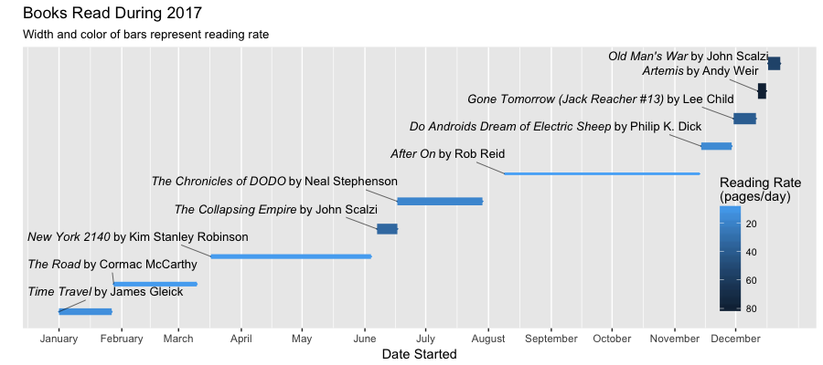
As you can see, my reading list this year is puny. But hopefully I made up for it with a pretty graph. Some notes from this year:
- I do not know why After On took so long to read, but it did. It was alright, but not really worth the time.
- I am becoming a big fan of John Scalzi. Shaina’s dad got me a bunch of sci-fi ebooks for the holidays (including a lot of Scalzi), and I’m really looking to reading them next year.
- I was pretty disappointed with two of my favorite authors. Both Artemis by Andy Weir and The Chronicles of DODO by Neal Stephenson were alright, but not nearly as amazing as their past works.
- I can’t quit Lee Child’s Jack Reacher series. He’s still pumping out engaging page-turners, and even though his books are like the potato chip of the brain (easy to eat, but not filling), I’ll probably still keep reading these whenever I’m stuck in an airport.
One of my promises to myself (not a resolution) for 2018 is to only read for pleasure on my commute. It’s 45 minutes of downtime, and I think reading for pleasure will make the transition from work/school to home much better. That being said, I’m sure I’ll still occasionally read a last-minute journal article or work-related item on the commute.
Technical aspects
If you’re curious how I created the graph above, I also wanted to provide the full code with explanations. If you have any suggestions for how the code can be improved, please leave a comment below.
First, load the libraries
library(tidyverse) # mostly for ggplot and reader
library(ggalt) # for geom_dumbbell
library(ggrepel) # for pretty labels that don't overlap
# library(extrafont) # for an error I receive when trying to italicize words
# font_import(pattern="[A/a]rial", prompt=FALSE) # same
library(mediumr) # to publish an R Markdown file to medium
Then, we need to load the data and add some formatting. The only way I could get the labels to be partially italicized was to add that to the original data, and then use parse=TRUE below.
books.2017 <- read_csv('https://github.com/angoodkind/angoodkind.github.io/blob/master/files/books_2017.csv')
books.2017$`Date Started` <- as.Date(books.2017$`Date Started`, "%m/%d/%y")
books.2017$`Date Finished` <- as.Date(books.2017$`Date Finished`, "%m/%d/%y")
# We can do arithmetic with our dates using `difftime`, so `Reading Rate` is just pages/days
books.2017$`Reading Rate` <- books.2017$Pages/(as.numeric(difftime(books.2017$`Date Finished`,
                                                 books.2017$`Date Started`)))
The data frame looks like this, using glimpse from dplyr:
glimpse(books.2017)
## Observations: 10
## Variables: 6
## $ Title           <chr> "italic('Time Travel')", "italic('The Road')",...
## $ Author          <chr> "'James Gleick'", "'Cormac McCarthy'", "'Kim S...
## $ Pages           <int> 353, 324, 624, 334, 768, 577, 246, 434, 322, 332
## $ `Date Started`  <date> 2017-01-01, 2017-01-28, 2017-03-17, 2017-06-0...
## $ `Date Finished` <date> 2017-01-27, 2017-03-10, 2017-06-04, 2017-06-1...
## $ `Reading Rate`  <dbl> 13.576923, 7.902439, 7.898734, 33.400000, 18.2...
Now on to the plotting! The initial call to ggplot provides a frame for everything below. Because I’m using geom_dumbbell, I can specify where each line begins and ends with x= and xend=, respectively.
ggplot(books.2017, aes(x=`Date Started`, xend=`Date Finished`,
                       y=reorder(Title,`Date Started`),
                       color=`Reading Rate`))
I could probably something like geom_line from ggplot, but it’s fun to experiment with new packages. This is basically a dumbbell without the dumbbells, and just the bar in the middle. Yes, I realize that both size below and color above are scaled by Reading Rate. This is redundant, but I felt that the redundancy more effectively communicated how slowly or quickly I read a book.
geom_dumbbell(aes(size=`Reading Rate`),size_x=0, size_xend=0)
Format the axes of the chart. Get rid of the y-axis, and use date formatting for the x-axis. When I tried using date_breaks it also included January 2018, which was annoying.
scale_y_discrete("", breaks=NULL) +
scale_x_date(breaks=seq(as.Date("2017-01-01"),
                        as.Date("2017-12-01"),
                        by = "1 month"),
             date_labels ="%B")
ggrepel is my favorite new(ish) R package. It ensures that labels do not overlap, which saves a ton of manual work.
All of the nudging and adjusting is to finagle with the exact positioning of all of the labels. I don’t know of any magic bullet for these.
The one thing I had a lot of trouble with was formatting the italics in the labels. Every few runs, it would throw an error about polygon shapes, and I’d have to restart R. If your data isn’t formatted, you can use something similar to the first aes statement. Otherwise, you need the second aes statement plus parse=TRUE. [Update 8-10-19: A new library, ggtext, looks like a really good solution to this issue.]
geom_text_repel(size=3.5,
                ## use labels without formatting
                # aes(label=paste(Title,'by',Author)),
                # comment out the next two lines to use unformatted text
                aes(label=paste(Title,'by',Author,sep='~')),
                parse=TRUE,
                nudge_x=0.3,
                nudge_y=0.5,
                direction='y',
                hjust=1,
                vjust=0,
                segment.size=0.2,
                color='Black')
Next, we want to add some labels to our chart. There isn’t much going on here, and y='' is probably redundant to what’s in scale_y_discrete above.
labs(x = 'Date Started',
       y = '',
       title = 'Books Read During 2017',
       subtitle = 'Width and color of bars represent reading rate')
Finally, set the options for the legend so it’s transparent and overlaps the chart area. Setting guides(size=FALSE) removes the legend corresponding to the size set above, so we only have one legend for color.
theme(legend.position=c(0.93,0.3),
        legend.background=element_blank(),
        legend.text=element_text(size=8)) +
  scale_color_continuous("Reading Rate\n(pages/day)",
                         trans = "reverse") +
  guides(size=FALSE)
And that’s it! If anything didn’t make sense, please let me know in the comments. Also, if you’re at Northwestern, I’ll be giving a tutorial on ggplot at January’s R User Group meetup.